
FUDGET APP
Research, analysis, and redesign
OVERVIEW
Through this collaborative piece, the budgeting app, Fudget, was analyzed and interface redesigned, along with new features like accessibility changes and currency exchanges.
ROLES:
Irene - Personas, UI design (collaborated)
Madison - Flow, UI design (collaborated)
Elisabeth - Personas and flow reviews (collaborated)
BACKGROUND RESEARCH
WHAT IS FUDGET?
Fudget is a personal finance app that seeks to help users in a fast and accessible way. We looked at this app through the lens of underclassman at American University. Finding it's two versions:
- Basic Version: Simple for income and expense listing, through one tap for adding and editing.
- Pro Version: Dropbox save/restorable data, theme personalization, export options, calculator, ad removal.

AMERICAN UNIVERSITY
-
39% of students are international.
-
7 ranked for study abroad in United States Colleges and Universities
Located in Washington, D.C. in the Tenleytown/ Spring Valley area - approximately 1 mile from the Maryland border. This institution has:
-
8,123 Undergraduate Students.
-
61% will study abroad at some point.
-
#10 ranked for School of International Services
UX/UI PROCESS
RESEARCH
EMPATHIZE
-
User Interviews
-
Fudget Reviewing
-
Competitor Reviewing
-
User Personas
-
Pain Points
CREATE
EVALUATE
-
Flow Map
-
Design for Personas
-
Update and implement improvements
-
User tests
-
Redesign
USER INTERVIEWS
Through multiple interviews with American University underclassmen students
-
100% Did not like the color orange - found it to be annoying
-
67% Had little to no budgeting experience
-
67% Enjoyed the simplicity of Fudget
-
33% Found the idea of budgeting overwhelming
-
33% Found one of the current language on Fudget to be confusing
PERSONAS

Emily Lopez
Year: Freshmen

Reanna Wade
Year: Sophomore

Danyal Mullins
Year: Sophomore
Used to budget on Good Budget when his bank account looks low.
Has budgeted before with google sheets and
roommates.
Big spender that has never budgeted before.
From Argentina and her parents income is in Argentine pesos.
From California and is now studying abroad in Germany.
From Idaho and is now adjusting to the D.C. cost of living.
Wants to calculate how much money she is spending in her home country's currency.
Wants an easy way to budget abroad and keep track of how much she is spending.
Wants an easy way to budget that is also accessible to his colorblindness (deuteranopia)
Cannot budget in US dollars.
Cannot budget in US dollars.
Cannot budget comfortably.
SIMILARITIES & DIFFERENCES
AMONGST PERSONAS:
-
Reanna and Emily both need the currency exchange feature as they are both abroad; Danyal does not.
-
Danyal and Reanna both have budgeting experience; Emily does not.
-
Danyal requires the app be accessible to his deuteranopia; Emily and Reanna have no accessibility issues.
-
All require an app that is easily learned and fits a students' needs.
ANALYSIS & COMPETITION
FUDGET (OVERVIEW)
GOOD BUDGET
MINT
-
Simple + Intuitive
-
Customizable categories
-
Good affordance
-
Brief onboarding experience
-
Able to sync other accounts on the free versions
-
Displays credit score
-
Auto-logs your income and expenses
-
Able to add credit and/or debit cards
-
Tracks your investments, properties, cash, etc.
-
Automatically adds leftovers money to savings
-
Free data and income vs. spending reports
-
Reminds you to keep on track your budget
-
Have to manually input spending habits based on the envelopes
Easy to use
Accessible
Intuitive
Easy to use
Accessible
Intuitive
Easy to use
Accessible
Intuitive



CURRENT PROBLEMATIC FEATURES
-
Fudget's interface feels rudimentary
-
Requires personal effort to self-catalog every expense
-
Difficult to move specific payments to different budgets
-
Ex. If you accidentally type something in the wrong category, you need to delete and re-type it
-
-
The bright color is unappealing to all users interviewed
-
Red and green color makes income and expenses hard to read
-
Currency conversions are non existent
HYPOTHESIS
CURRENCY EXCHANGE
COLOR BLINDNESS

With the currency exchange changing daily, it should be reflected in the features for those students...
-
Whose families' incomes are in different currencies.
-
Studying in a country with a different currency.
Currently, the orange turns green to those with deuteranopia. This can get confusing with the connotation of green as positive and red as negative. Switching to something with more clear symbols may help the consumer.
SOLUTION PLAN & PROCESS
OUR QUESTION
How can we improve Fudget for the American University student audience?
PROCESS
1. Create the flow chart
2. Testing
3. Correction of findings
4. Re-design of UI
SOLUTION
Redesign the UI for accessibility, and correct the currency data to hold an accurate currency exchange

SITE MAP


UX ANALYSIS
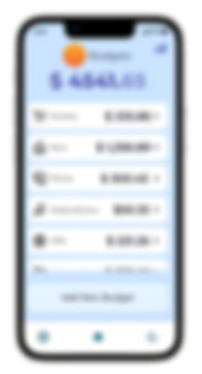
#1 REDESIGNING THE "ADD BUDGET" BUTTON

FUDGET
-
"Add New Budget" button disappears once you add multiple items
REDESIGN
-
"Add New Budget" button is locked on the bottom
-
Budgets are still scrollable
WHY OUR PERSONAS CARE
-
As they are using this app over time, if they can't find the budget button when it was previously there, it can lead to difficulty in usage
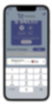
#2 REDESIGNING "ADD INCOME/EXPENSE" BUTTON
FUDGET
-
"Income/Expense" button disappears once you add multiple items
REDESIGN
-
Create an "Add" button on top
-
Users can pick if it is an expense/deposit by choosing the + or - sign
WHY OUR PERSONAS CARE
-
The terminology we found in interviews to be confusing and the "Add" button will help clarify this
-
These symbols will also help with color blindness as they are more noticeable

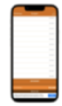
#3 ADDING A NAVIGATION BAR FOR CURRENCIES
FUDGET
-
Difficult to find setting to change the currency symbol
REDESIGN
-
Easier for users to find currency by adding it to a bar which is seen on the main budgets page
-
More options with currency
WHY OUR PERSONAS CARE
-
Because some are abroad and will be able to travel across countries much easier, having a navigation bar will help them search what currencies are nearby and add as they travel

#4 NEW COLORING
FUDGET
-
Bright orange which consumers found to be "annoying"
REDESIGN
-
Uses a cooler blue-toned color scheme
WHY OUR PERSONAS CARE
-
It generally makes the app more appealing to look at, doesn't add to difficulty for the consumer
-
Also, is beneficial to those who suffer from color blindness

Primary
Secondary

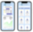
BEFORE & AFTER
CURRENCY

Actual data and currency exchange updated through Google finance data
The original version just changes the visual symbol, not the values
ACCESSIBILITY

DEUTERANOPIA

KEY TAKEAWAYS
UX FLOW TAKEAWAY
REDESIGN TAKEAWAY
USER RESEARCH TAKEAWAY
-
Highlighting the key components in the walkthrough will make users aware
-
Currency will impact all values on your budgets, showing again that interconnected nature
-
Large symbols on prices will make it more accessible to colorblind users
-
Everything is connected with each other
-
Ex. Primary currency screen is accessible through
multiple points
-
Settings vs Options was complicated to differentiate
-
Our users will have a use for converting currency for all of their budgets
-
They are relatively new to budgeting and having a more comprehensive tutorial will help them feel more comfortable


